In an increasingly data-driven world, the ability to communicate effectively with data is becoming an indispensable skill. It doesn't matter how convincing your data is if you can't communicate your insights clearly.
One of the biggest decisions you have to make when communicating with data is how you will present that data to others. How do you choose among the many possible methods of presenting your information?
Which one will be the easiest to understand? Which approach will be the most effective?
Should I create a chart or graph? Or will it be better to share my entire data table?
Choosing the best format for presenting your data can go a long ways to determining the success of your communication efforts.
This guide will walk you through the most important information you need to know to make the best decision for your situation.
Difference Between Tables, Charts, and Graphs
Before you can decide what type of data visual you should use, it is important to understand what your options are, and what makes each of them unique. By understanding the strengths and weaknesses of each approach, you can make the most effective choice for sharing your data.
Table Definition
At their most basic level, tables are a visual arrangement of data, typically in rows and columns. While numeric data is the most common type of data contained in tables, they could also include text or even visuals such as icons.
The information in tables is typically displayed in simple rows and columns, although some specialized tables can utilize much more complex structures. This layout is designed to help readers read and compare the information in the table and reach the desired insights.
The tables below provide some examples of how tables can be used to show information over time or to compare different options to each other.

Item 1 | Item 2 | Item 3 | Item 4 | Item 5 |
|---|---|---|---|---|
Feature 1 | Feature 1 | Feature 1 | Feature 1 | Feature 1 |
Feature 2 | Feature 2 | Feature 2 | Feature 2 | Feature 2 |
Feature 3 | Feature 3 | Feature 3 | Feature 3 | Feature 3 |
Chart Definition
Charts can include any visualization of information in which data is represented by some combination of text, symbols, or drawings. This term can include anything from basic bar graphs to maps or even hand-drawn diagrams.
The primary difference between charts and tables is that while tables focus on presenting data in a simple tabular form, charts can take just about any form. Charts can be used to illustrate relationships in much more varied ways. The focus is on making the information in the chart easier to interpret visually, rather than reading and interpreting.
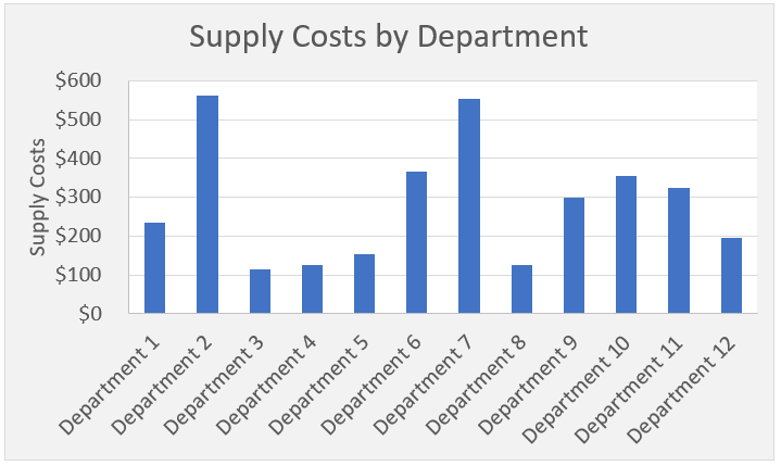
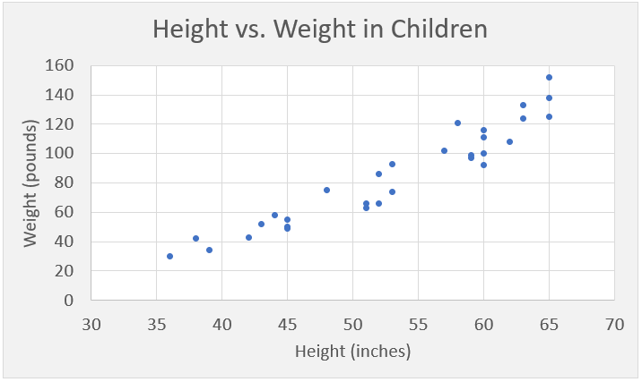
As shown in the examples below, charts can be used to show the breakdown of costs by department, the relationship between height and weight in children, or many other situations


Graph Definition
You might be asking yourself if charts and tables are your only options. What about graphs? Are those better or worse than charts? How are they different?
Many people use the terms chart and graph interchangeably. And they are quite similar. Technically speaking, graphs are really a subset of charts. They are a specific type of chart that show the mathematical relationship between sets of data.
There are other similar terms that can be used to describe visual depictions of data, such as plots or figures. For our purposes, I am going to stick with the generic term charts to refer to all non-table data visualizations. This is the terminology used internally within Excel, so for consistency, that is what we will use going forward.
Should I Use a Table or a Chart?
It may be tempting to just choose one option and use it all the time to share your data.
My data is already in a table in Excel, so I'll just share that. Besides, I wouldn't know which type of chart to use anyway.
I think colors and pictures look better. Why would I use a boring table instead of a fancy chart?
Both of these extremes have their drawbacks. By understanding the advantages and disadvantages of tables and charts, you can make sure you are using the approach that will get you the best results.
Luckily, deciding which way to go is not as difficult as it may seem.
We will cover several factors that you should consider when choosing to use a table or chart, but there is one factor that should be your primary concern. If you only consider this one factor, you will likely choose the right approach most of the time.
Is your goal to share specific data, or are you sharing higher-level insights or trends?
Generally speaking, tables are your best bet if you want to share specifics, and charts will work best for trends or summary observations.
The reason for this is related to how humans read and interpret information. Our brains have been trained to process information in certain ways that are related to how the information is presented. By aligning the presentation approach to the way you want your audience to process the information, you will have more success in your communications.
Let's go through a quick example to show how this works in real life.
Table Example
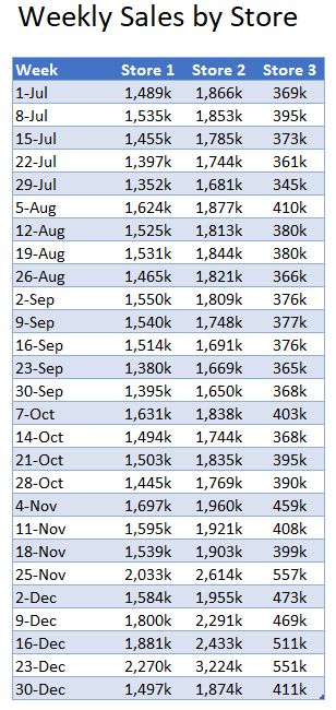
Below you will see an example of how weekly sales information across three stores could be summarized in a table. All of the individual values for each store are shown so that they can be reviewed and compared.
If you are trying to share overall trend information or highlight an interesting observation, it could be a little difficult for your audience to interpret.
Let's try it out.
Take the next 5-10 seconds to review the table and come up with one or two key takeaways you notice based on the information in the table.

Not too easy, is it?
My guess is that if I asked 10 people what their key observations were, I would probably get at least 7 different answers. That's not very effective.
Now let's say your audience wants to know how each store performed during the week of October 7.
That's much easier. Most people will be able to quickly and intuitively skim down to 7-Oct and see the specific results for each store.
Chart Example
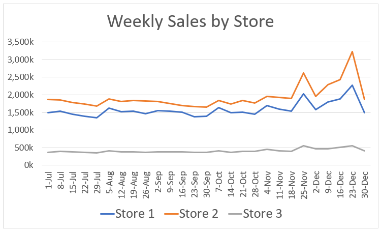
As a contrast to the table above, let's see what would happen if a chart was used instead to represent the same data.
Take the same 5-10 seconds to review the chart and make one or two observations.

This is much easier than with the table. In just a few seconds, most people are likely to come up with some variation of these two observations:
- Store 1 and Store 2 have much higher sales than Store 3. (Store 2 is consistently the highest.)
- All three stores experience a bump in sales around Thanksgiving and Christmas.
The visual nature of the data presentation makes it much easier to quickly see the trends and outliers in the data.
Now, back to the second question from above. What were the sales from each store the week of October 7?
This one is actually more difficult with the chart. We can visually see the relative level of sales between the stores based on the position of the lines, but estimating the actual values is difficult. We have to try to line up the data line with both the date and sales axis, which is very inexact and time-consuming.
When to Use Tables
As you can see from the examples above, tables are best used when you want your audience to dig into the specifics of the data you are sharing. In this case, tables will make it much easier to read and interpret the information being presented.
Times when tables are likely your best choice include:
Using tables in these situations will take advantage of the natural benefits of tables to increase the ability of your audience to interpret your data.
When to Use Charts
As illustrated above, charts are best used when you need to simplify complex data into trends, patterns, or insights. The visual nature of charts allows you to turn abstract values or information into a visual format that is easier for our brains to interpret.
Whenever possible, charts should be considered as the primary method for sharing data insights. The visual nature of charts match the way our brains naturally interpret information. This will help your audience quickly and easily interpret the information you are sharing.
Can you use both tables and charts?
If both tables and charts have advantages and disadvantages, you may be asking if there is a way to get the best of both worlds. There are times when it makes sense to include both tables and charts in your communication.
Here are some ways in which this combination approach can be accomplished:
Other Factors to Consider
While the goal of your communication should be the primary deciding factor when it comes to choosing to use a table or a chart, there are other factors that can come into play at times. While these factors may not ultimately change your decision, it is good to consider them, just in case.
Audience
The nature of your audience could have an impact on how you share your information.
If you are communicating with a very analytical audience that likes to dig into the details or verify your conclusions, you may want to include a table of the raw data. This could be in place of a summary chart, or as supplemental information.
On the other hand, if your primary audience is busy executives, they likely want you to cut to the chase. How quickly can you communicate your conclusions? In this case, a simple chart is likely your best bet.
The key here is, the better you know your audience, the better you will be able to tailor your communication to their desires.
Publishing Format
The format that you are going to use to share your data can have a big impact on the way in which you present that information. The approach you use needs to fit with the inherent strengths and weaknesses of the format you are using.
For example, if you are creating a presentation slide that will be used to share information with a large group, presenting your data in a large table with a lot of numbers will not be very effective. You don't want your audience straining to read the numbers in the table and getting distracted from the message you are trying to share. Instead, try using simple charts with clear colors and large, brief text to support your main points.
Example formats that could require you to adjust your approach include presentation slides, written reports, emails, posters, billboards, or marketing materials.
You may even need to customize the way you share the same point for each format you use. Don't use the same chart or table for everything. You will save time by not creating additional visuals, but you could ruin the effectiveness of your communication in the process.
Presentation Context
In addition to the physical format of the materials you are using, you should also consider the context in which those materials are used by the audience.
How long will the audience see your visual? Is it meant to be a stand-alone document or will you have a chance to explain, highlight points, or give additional context?
Don't try to create a dense, complicated visual that your audience will not have time to comprehend. If they will only see a slide for 20 seconds, only give them 20 seconds of information to absorb.
If you will not be present when your audience sees your visual, don't simplify the information so much that the context and meaning are lost. Include the necessary information to ensure your audience understands your complete point correctly. See if you can preemptively answer their questions with a few small tweaks to your table or chart.
Make sure you are thinking about your communications from your audience's perspective. You may need to make adjustments to your approach to ensure that the communication is effective. Some adjustments may even go against the advice above, but are necessary given your specific situation.
Quick Reference Guide
Situation | Table | Chart |
|---|---|---|
Trends and patterns (eg. change over time) | ||
Summarizing large amounts of data | can be used if the summary data meets other criteria for tables | |
Illustrating relationships in data | only if can't be done with chart | |
Identifying outliers or evaluating variability | ||
Describing relative sizes of values | ||
Specific or exact values | data labels can be used for small number of points | |
Sharing raw data | ||
Sharing simple message | use 1-2 text values instead of table | keep chart simple |
Interactive Data Analysis | if specific values are important | if focused on trends/patterns |
