We all want to predict the future. Life would be so much easier if we always knew what is going to happen next.
That is why prediction is one of the primary reasons that we analyze data. We want to know what is driving our results and what is going to happen in the future.
Are my results getting better or worse? Will I meet my goals next month? Do I need to make any course corrections?
The desire to identify and respond to data trends leads many people to inappropriately use a very common tool:
Trend lines.
While it seems like a tool with trend in the name would be great for identifying data trends, the truth is far different.
In reality, trend lines are typically unnecessary at best and misleading at worst.
While it may seem like a good idea at the time, adding trend lines to charts can lead to incorrect conclusions about your data or make a simple chart more difficult to interpret. Either way, the addition ends up being unhelpful despite your best intentions.
Let's go through some examples to illustrate why you are better off avoiding the use of trend lines in your data analysis.
Why are trend lines so common?
If trend lines are such a bad idea, why are they so commonly used?
Ease of Use
I think the number one reason that people add trend lines to their data is that it is easy.
It only takes a few clicks to add a trend line in Excel. Once you have learned to do it, it takes almost no effort to add to any chart.
I think this is the same reason that the Microsoft Office support page provides the steps for adding a trend line on their how to create a chart page. It takes a whopping three steps to make a noticeable change to your chart.
Unfortunately, just because something is quick and easy, doesn't mean it is the right thing to do.
Just because something is quick and easy, doesn't mean it is the right thing to do.
Substitute for Real Analysis
What are people trying to accomplish when they add a trend line to data?
Typically, they want to illustrate a point to their audience using a visual depiction of their data. And what better way to illustrate that point than to add a simple line that show which direction the data is trending? It's quick and easy, and it makes the chart look a little bit fancier while giving the impression that you have truly analyzed and understand your data.
And who can argue with a line that is obviously going up or down?
Unfortunately, this thought process gives people an excuse to skip real data analysis and just add lines to their data that support their predetermined conclusion. Often, if the trend line doesn't point the right direction, I have seen people edit or omit data points, or just leave the trend line off altogether.
None of this adds value to the conversation. None of it will help you understand what your data is really telling you. Adding a trend line is not a legitimate substitute for actual data analysis.
What's wrong with using trend lines?
So, if trend lines don't add any value to a chart or analysis, they are an unnecessary addition. But is that so bad? Maybe they clutter up the chart, but they can just be ignored, right?
Unfortunately, the use of trend lines can also be misleading. They can cause you to draw incorrect conclusions from your data and lead to poor decisions.
Let's go through a few specific examples that illustrate how this can happen.
Seeing trends that don't exist
Let's start with an example data set. The chart below depicts the number of orders received per month over the last 10 months. In order to answer the question of whether or not sales are increasing, I have added a trend line to the data.
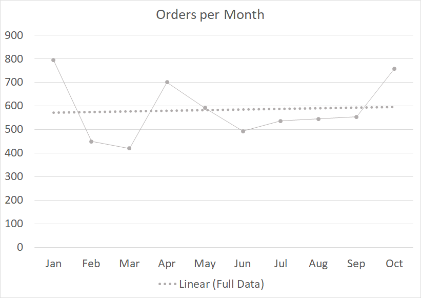
As you can see from the trend line, sales are obviously increasing. Whatever we are doing is working. The sales are increasing at an annual rate of around 5% according to the trend line.
But are they really?
In this case, I know for a fact that there has been no change in the process. The data for this chart was generated using random variability around a stable average of 600 orders per month. Any potential trends that appear in the chart are just the result of random variation in the data.
This happens more often than most people realize.
We see a trend line that is sloped up or down and assume that the output is actually changing in a predictable fashion. While a more rigorous statistical analysis could help us determine if the trend is actually real, most people don't have the knowledge to perform that analysis.
In the absence of that next layer of insight, we need to be very careful in assuming that trend lines are actually showing us a significant trend.
Impact of single points
Sticking with the same data set, let's take a look at what happens if the data range is changed just slightly.
The charts below illustrate what the trend line would look like if we calculated it using just nine of the ten data points in the original data set. The first chart looks at the data from January to September and the second shifts by just one month to include February through October.
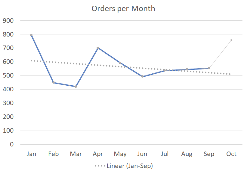
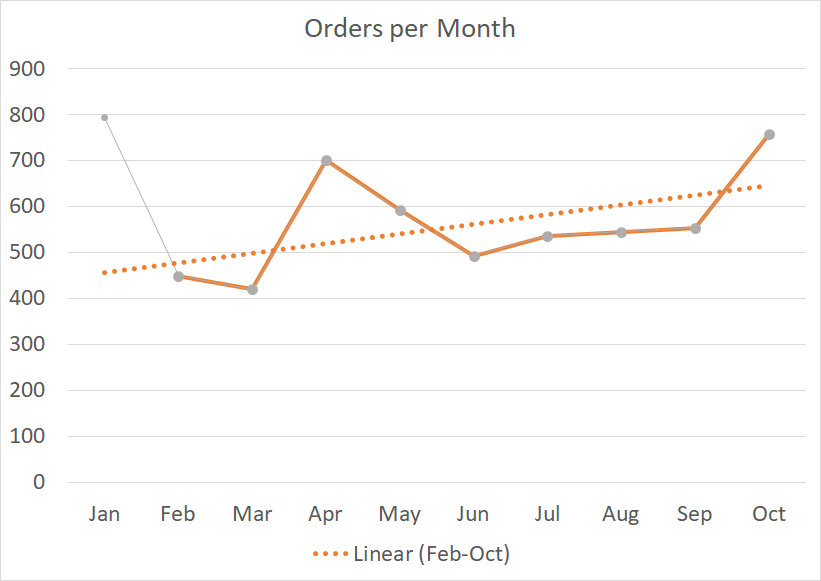
The conclusion you would draw from each of these trend lines is drastically different. By shifting the data set over by just one month, your conclusion could change from "Oh no, we're losing sales fast" to "Wow! Sales are going through the roof!"
Again, this data was created using a process that is not shifting at all. In reality, there is no trend. But the inclusion of just one or two extreme points at the wrong time can fool you into thinking that there really is something going on if you just rely on the slope of a trend line.
These are examples of the statistical concepts of leverage and influence. We won't go into them in detail here, but it is good to know that there are times when just a single point can drastically impact a linear regression trend line. If we blindly trust the lines that Excel adds to a chart, we can end up drawing false conclusions.
Misrepresenting actual trends
Let's take a look at another example using data in which there actually is a process change and see how trend lines perform in this situation.
The chart below was created using a similar process to those above. In this case, the output was generated randomly around a stable average of 500 orders per month from January to June and then a stable average of 750 orders from July to December. A basic trend line was then added using all twelve data points.
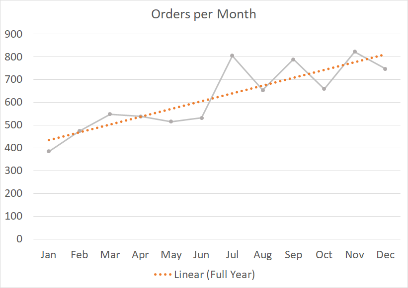
The trend line does accurately indicate an increase in sales, but it also implies some conclusions that are not accurate.
First, the trend line will lead most readers to overestimate the improvement that occurred. It is natural to look at the beginning and ending of the trend line and assume that they represent the improvement that was achieved.
In this case, it would appear that the process improved from less than 450 orders at the beginning to over 800 at the end. This would represent an increase of around 90%. This is much higher than the actual 50% increase.
An additional conclusion that is erroneously implied by the trend line is that the results will continue to rise. It is also natural to look at a line that is increasing and assume that this trend will continue into the future.
If this was the case, the orders would be expected to continue to increase up over 900 per month in just a few short months. Again, based on the actual process involved, we know that the orders should average around 750 per month going forward. The future increase implied by the trend line is false.
This example highlights some of the shortcomings of trend lines with regard to accurately illustrating actual trends in data. Most changes don't follow a linear pattern, therefore can't be accurately represented by a simple linear trend line.
How to show a step change in data
There are times when it can be beneficial to highlight a step change in your data in way that makes the improvement more clear. In this case, rather than using a trend line to show the improvement, try using average lines that divide the data into segments, as shown below.
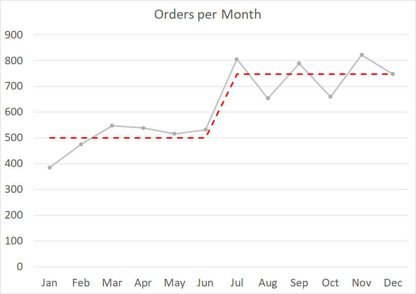
This look can be achieved by creating a separate column that calculates the average value for each segment of the chart and then graphs it as a separate series. This same approach can be used for two, three, or even more segments.
This approach will help you avoid the weaknesses of using trend lines while still highlighting the trend in your data in a meaningful way.
What to use instead of trend lines?
In a word, nothing.
Most of the time, you are going to find yourself in one of two situations: Either you have a clear trend in your data, or you don't.
If there is a clear trend in your data, most people will be able to see it without the help of a trend line. It would just be extra information cluttering up your chart and making it more difficult to read.
If there is not a clear, statistically significant trend in your data, you shouldn't imply there is one by adding a trend line. That will just mislead your audience in the ways that we illustrated with our examples above.
If you must point out significant points or changes in the data (and you are sure they aren't just random variation), you can do so using data labels, notes, or highlights to emphasize aspects of your message.
When trend lines should be used
So, I have spent a good deal of time explaining the weaknesses of trend lines and trying to convince you to stop using them.
But are there any situations in which trend lines can be useful?
Trend lines can be a useful tool, but only in the context of a broader analysis.
Trend lines are a common addition to several types of statistical analysis including correlations and mathematical modeling. In these cases, they are used to visualize data that is expected to follow a linear trend so that you can visually evaluate how close the relationship is to linear. While this visual element is included in the analysis, it is supported by more detailed calculations to help ensure a proper interpretation of the data.
Trend lines can also be used in forecasting situations in which a linear trend is being used to predict future values of a measure. Again, these trend lines should also be supported by additional levels of analysis, such as sensitivity or feasibility analysis, to ensure the linear trend assumption is valid and to highlight the potential error in the forecast.
Another specialized use of trend lines is in the financial analysis of stock prices over time. Even in this situation, you must know the assumptions that are being made when using this method and ensure your conclusions align with other indicators and analysis.
Relying on a trend line alone is never a good idea.
